First, let me just say that none of this work would be possible without my buddy Dan Roge’s help. In fact, he has a breakdown of the work on his website that I’d highly recommend checking out if you’re interested to learn more.
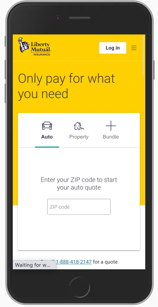
The image you see below is that of Liberty Mutual Insurance’s homepage. It’s simple, it’s intuitive, and it delivers on promises made by the company’s famous mascots, Limu Emy and Doug. (You probably have the jingle in your head now. I’m sorry about that.)
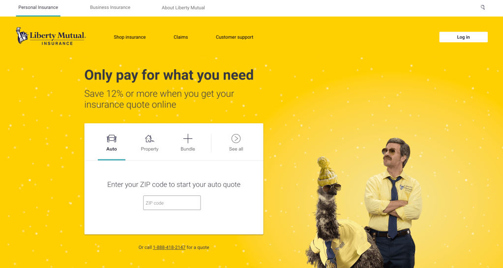
This experience looks easy enough to pull off, right?
It wasn’t.
When I joined Liberty Mutual in the fall of 2017, the company had recently kicked off a digital transformation initiative that was meant to reshape how the company worked, and the types of experiences it delivered to its customers. At the same time, it was ramping up aggressive new branding tactics in the incredibly-competitive auto insurance space.
Coming from the agency world, this was an incredible opportunity to make a meaningful impact at a Fortune 100 company. And by going brand-side, I was also selfishly giving myself the chance to test whether or not the traditional artifacts I’d delivered on for clients in the past were as helpful as we hoped they might be. (Spoiler: Some were, some weren’t.)
By the summer of 2019, Liberty has recently debuted their dynamic mascot duo of Limu Emu and Doug (featured in the screenshot above). At that same time, we were seeing both interesting and worrisome data related to user behavior on our homepage — effectively 50% of traffic was bouncing from the page. They weren’t quoting, or logging in — two of our Key Performance Indicators — they were simply leaving.
We’d determined at this point that our existing homepage design had run its course, and iterative testing wouldn’t move the needle significantly one way or the other. So we enlisted our product owners and marketing peers, and created a problem statement that would help sponsor a design sprint.
The problem statement: Half of the traffic to our homepage is not quoting or logging in. What potential friction in the experience is preventing them from taking meaningful action on our homepage, and how might we solve for it?
Our hypothesis: By creating a quoting hierarchy that defaults to auto insurance (our main line of business) and leverages our product taxonomy, we’ll reduce at least two steps in the top-of-funnel quoting flow. Conversely, by adding friction in our mega menu (which displayed on hover and took up a significant portion of the screen on mobile and desktop), we’ll reduce customer noise in hero space to quote. Finally, by adding our log in screen to the homepage and allowing them to sign in on the first page they come to (as opposed to clicking through to another page specific to log in), we’ll help our existing customers to more quickly log in and self service.
Old quoting module:

New module:
Design sprint
With buy-in from our business team and a clear, definitive problem statement and hypothesis backed by data, we got to work on interviewing our key stakeholders. At a company as large as Liberty Mutual, if you’re not careful the homepage and mega menu can become more representative of how you’re structured versus how the customer intends to navigate through your website. Lucky for us, every person we spoke with — from marketing to sales, policy management and mobile apps — was on board with our new vision.
Our goal was to create a simple experience that increased clarity and efficiency of those two most important tasks — once again, quoting and logging in. So after our interviews, we set to work on sketching opportunities to resolve those challenges through content design.
Less is more
Our content strategy was simple — let’s incorporate and deliver on our brand promise of customization. We propped up Limu and Doug in our hero and leveraged their seemingly overnight fame. We leaned into our new voice and tone, which celebrates personality while remaining straight-forward and to the point (insurance jargon can be hard, after all). And we leveraged our product taxonomy to help eliminate friction up front, and allow the customer to easily make their quoting selections, quickly — especially when quoting for home, or bundling their insurance products. We were even able to clean up the mega menu as well, and consolidated as much content as possible into customer-friendly action buckets.
Final result
In the end, our design sprint netted out a high-fidelity design that won approval from our VP of design and Senior Leadership. While the implementation of the page would bring on its own set of learnings, we ultimately launched early the following year to immediate positive results.
- $1.5 million increase in annual policies sold
- 10% increase in auto quotes
- 3.6% drop in bounce rate
- 2% sign-in increase, helping to improve operational costs through digital adoption and better positioning Liberty Mutual as a digital-first company with first-class capabilities.
