“Contact us.”
It’s an incredibly common web page that customers will often google in an effort to get help — be it a phone number, a virtual chat assistant, or something that can help us find answers, quickly. And yet those pages can become some of the hardest to find on a website.
The reason? They’re expensive. Not the page itself, but all of the overhead that they require: service representatives working in vast call centers.
We hear it all the time in the insurance business: customers think they want to pick up the phone to call, but what they don’t realize is that that simple action of dialing a phone number actually indirectly drives steeper premiums. It’s a business after all, and higher costs drive higher prices. The more service representatives you need to answer the phone, the higher your expenses are, and those expenses will then be pushed onto the customers. And in a space as competitive as auto insurance, the bottom line is truly what matters most to the customer.
So the question that was initially proposed to us in 2018 — and again in 2019, and every year I’ve worked at Liberty Mutual — is how do we get customers to self-serve online?
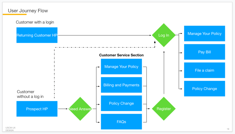
Understanding customer intent
In early-2018, I led a content audit to better understand how our customers were behaving within our customer service space. What we found was that this particular section of the website was extremely bloated, with overlapping and at times contradictory information that was causing general confusion for our customers. We knew this because call volume was tracked using unique phone numbers on each of these pages, and they were all really high compared to sign-ins on the page. Customers weren’t interacting with our self-service options, and our hypothesis was that the intent of these pages was pushing customers to defer to the phone versus our online capabilities.
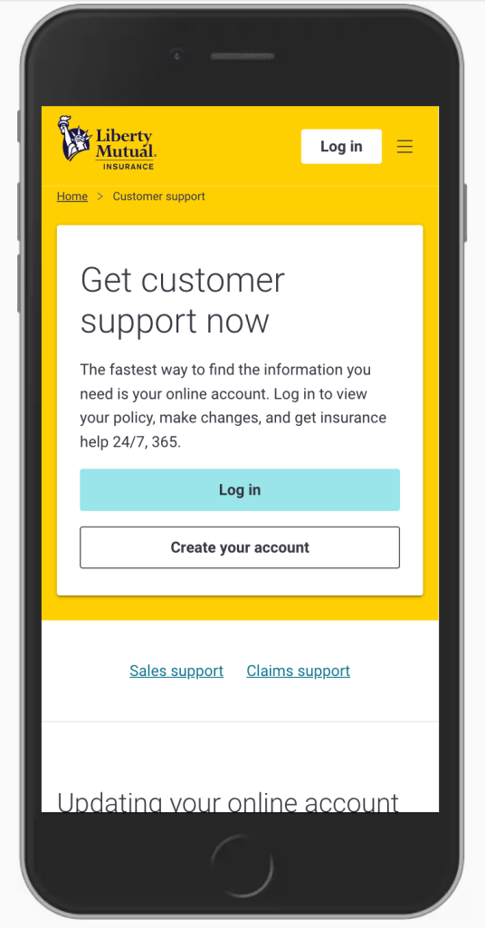
While we were able to sunset and re-direct a few duplicative pages, we understood that creating a clear purpose and intent for these pages would perhaps be most important when it came to changing our customers’ behavior. So we ran an easy experiment, and really focused on the words of our most popular page to call from (for obvious reasons) — Contact Us.
Using a simple A/B experiment, we tested how customers would respond to a page titled Customer Support versus one titles Contact Us. The result was that phone calls were reduced considerably, but customers were still getting confused about which phone number was right for their question — be it a service question, a claims question, or a sales opportunity. This was creating customer friction, and it was also adding additional time and resources as representatives were required to transfer customers from one center to the next, wasting valuable time on both ends of the phone.
So the next thing we tested was around customer mental model and creating a clear hierarchy. This was really simple as well — we removed customer FAQs from the top of the page and added clear accessible headers to each section:
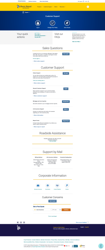
Sales Support | Customer Support
The results were dramatic: The page went from an almost even split of phone calls (452 service calls versus 571 sales calls in version A) to a huge disparity between call volume in version B – 852 service calls versus just 29 sales calls. We now had a clear signal of customer intent on the page — it was to get customer support only, not sales support.
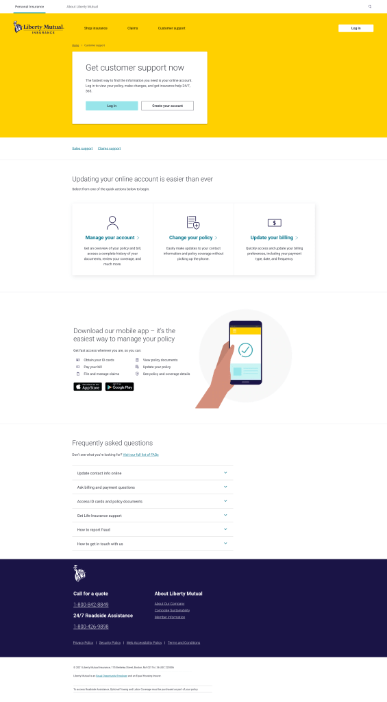
Redesigning Customer Support
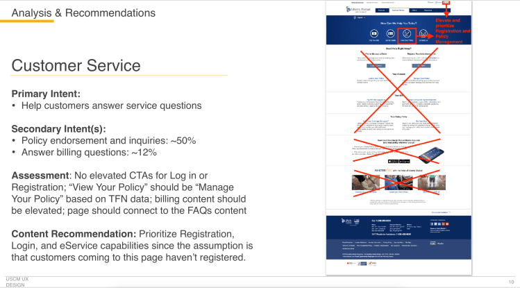
Now that we had a better handle on customer intent, we were able to make the business case that continued optimization of the support space would help reduce call volume and improve digital adoption.
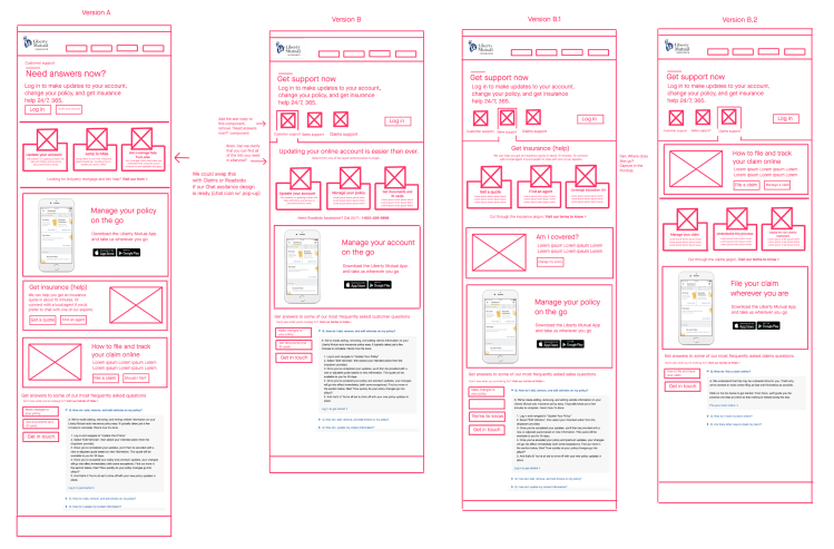
Once again, I led the UX team on exploration of a new support experience, this time sketching low-fi wireframes to visualize the opportunity for our business owners and developers. Leveraging our learnings from previous tests, we broke out each support tier into its own page which gave us the ability to highlight the unique digital capabilities associated with that relevant space. For example, on the Customer Support page we highlighted the mobile app, abilities to manage your policy online, and how customers could enroll in frictionless cost-saving programs like Autopay and Paperless billing. We were also sure to create clear value proposition messaging with direct calls to action into our logged in experience.
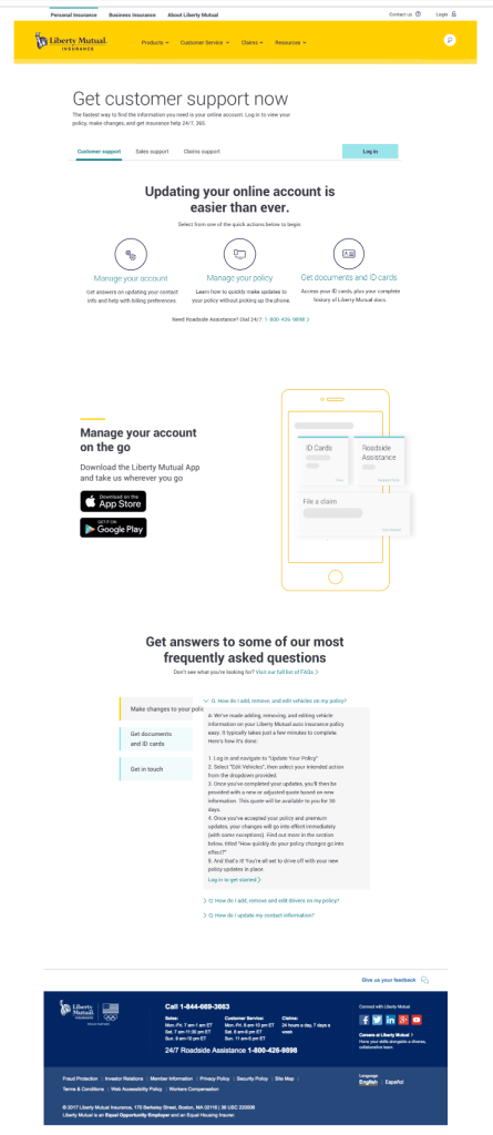
The result of this work led to:
- 28% reduction in calls
- 24% increased sign-in rate
- 19% reduction in bounce rate
- $213k in operational savings
What’s next
Our focus moving forward is to increase awareness and shortcuts into our logged in experience, so that customers can seamlessly self-serve without picking up the phone. We’ll also continue to promote our excellent mobile app, which we’ll message as the focal point of the digital experience for our customers.
For more on this effort, visit my old friend and former manager Ken Sigel’s site to read the case study.
