Check out the blog for a full case study on Liberty Mutual’s digital transformation.
Full-scale redesign
Atomic thinking
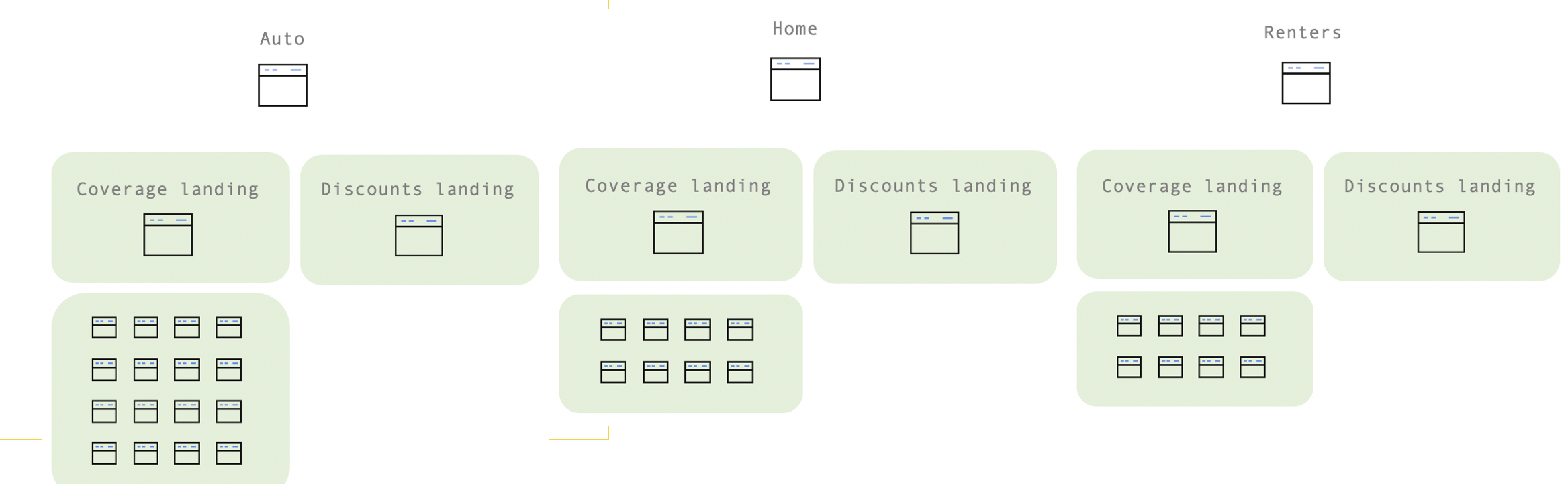
As UX Lead for the complete redesign of the Liberty Mutual website, I worked with our product designers to employ atomic design thinking. This helped us to create components that were purposeful and “small” but could also be shared amongst many layouts (flexible “templates”) and allow us to scale quickly once we had a more complete toolset.
After an initial workshop I facilitated to better understand the new platform and CMS we’d be migrating to, our design team kicked off the work by planning and executing a weeklong “hack-a-thon” to compare sketches, ideas, and notes while pressure-testing net new copy — copy that matched our brand goals of deploying a pithy, consistent voice and tone across the website. The goal was to create a mobile-first design that leaned on our research and hypothesis that a simple, frictionless experience that defaulted to our customers’ most common actions would greatly improve KPIs and user efficiency on our website.
Promising ourselves we wouldn’t design in a vacuum, we scheduled multiple touch-points with developers and product owners alike to share our vision, get feedback, and iterate based on what we felt was and was not working. We ended the week with ~90% of all components designed, and cross-function approval to move forward on implementation. At a company the size of Liberty Mutual’s, this rapid decision-making was nothing short of a miracle.
Developing and executing content design
In order to deliver on the type of experience we wanted for the new LibertyMutual.com, we needed to re-write the entire website so that it matched our voice and tone, and integrated naturally with design.
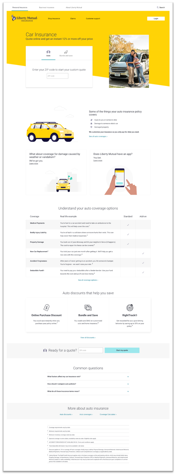
Working alongside our product designers, my colleague Katie Markarian and I employed the “Inverted Pyramid of Journalism” approach to content design: Open with the lead and a clear call to action, then narrow the focus of the page as the user scrolls to incorporate more insights for the customer that requires more information before making a purchasing decision. This strategy was deployed on our auto insurance page, and helped improve our SEO rank for “car insurance” from 9th to 3rd in a span of a couple of months.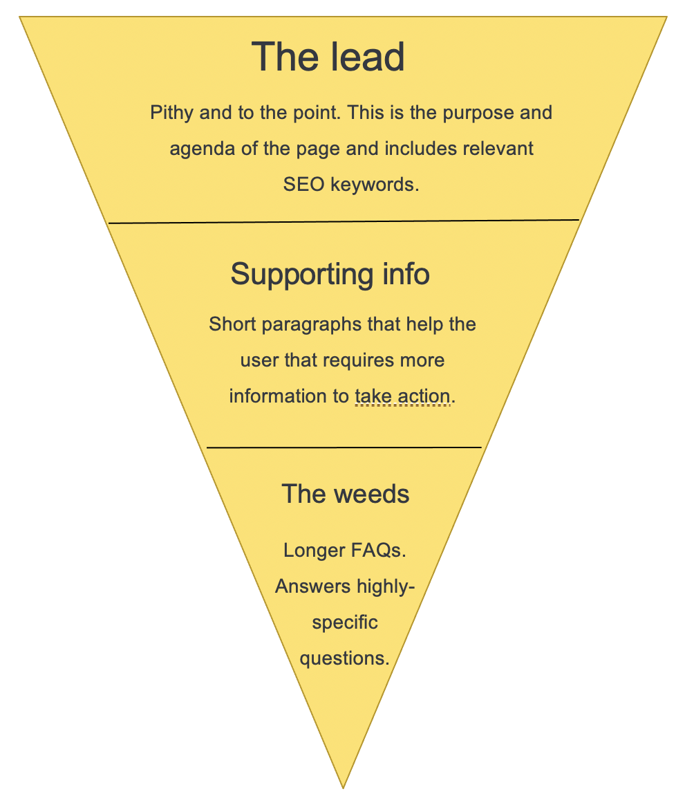
This was of course another consideration as well: ensuring all of our content was Google-friendly, employed smart use of keywords, and carried over as many relevant internal links as possible.
In the end, we re-wrote content for nearly 300 pages in just a couple of months.
The tipping point of components
While the build and deployment of pages started off slow initially, we insisted with our product owners and Leadership that as soon as we had enough components built to complete a handful of layouts, we’d be able to build a ton of pages quickly — it would just require a little more patience. (For their part, time wasn’t on our side — we had a very real deadline to get off of our old platform before a contract renewed, one that would put us on the hook for another $1million in vendor fees.)
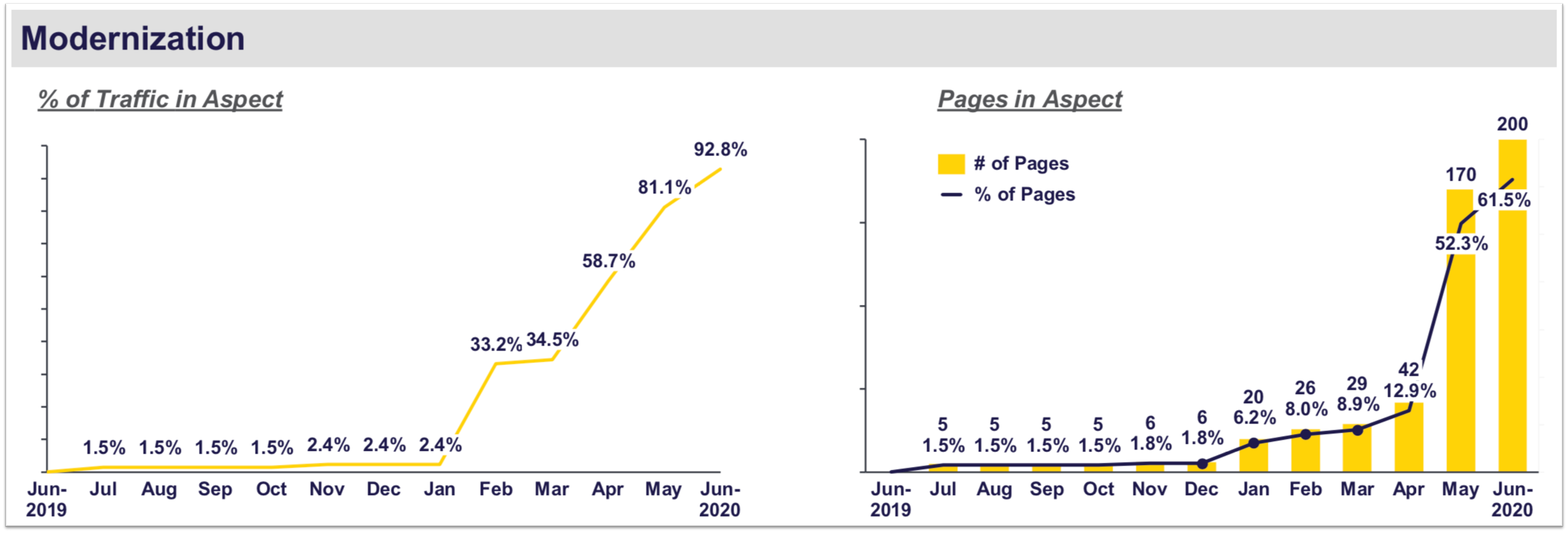
In May 2020 — less than three months after our initial hack-a-thon — we teamed up with our developers to mass migrate well over 100 pages using a content matrix and a clever mapping script. (Check out the image below to see visualize how migration evolved by month.) With our toolset near complete, we spent the next couple of months building our remaining pages.
Crossing the finish line early
On an early Sunday morning in mid-August — nearly a month before our drop-dead date to migrate off of our old platform — we flipped the switch on the remaining pages, redirects, and other origin points that needed to be updated and finished the redesign and re-platform of LibertyMutual.com.
The redesign accounted for the following metrics:
- Page performance increase: 40% faster
- Reduced the number of components used: 97 to 60
- $6 million in operations savings
- A website we can be proud of
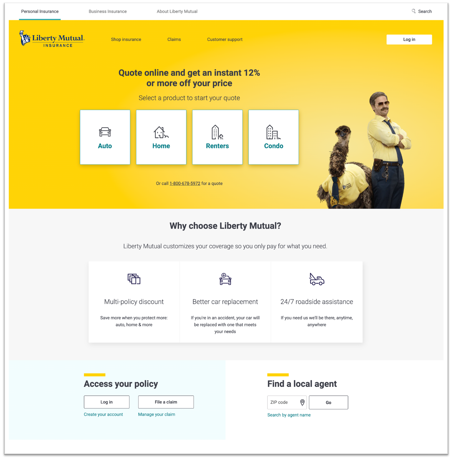
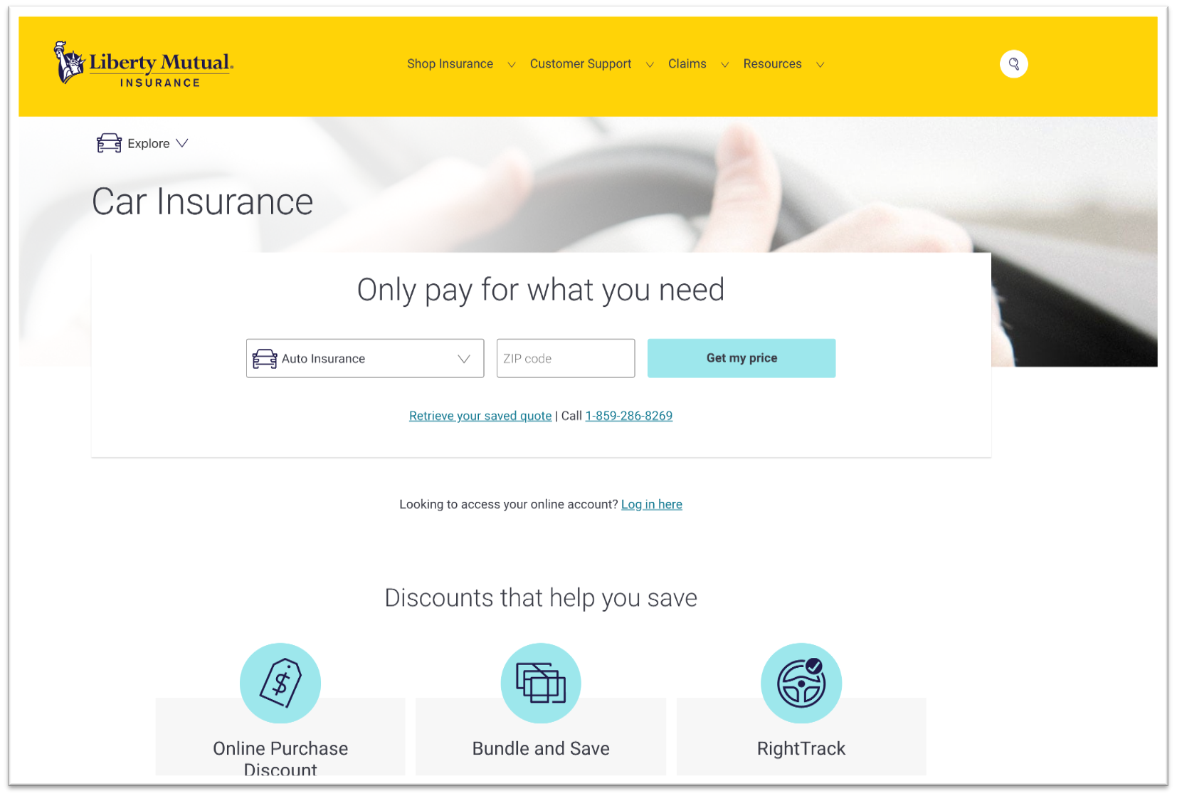
Our new website:

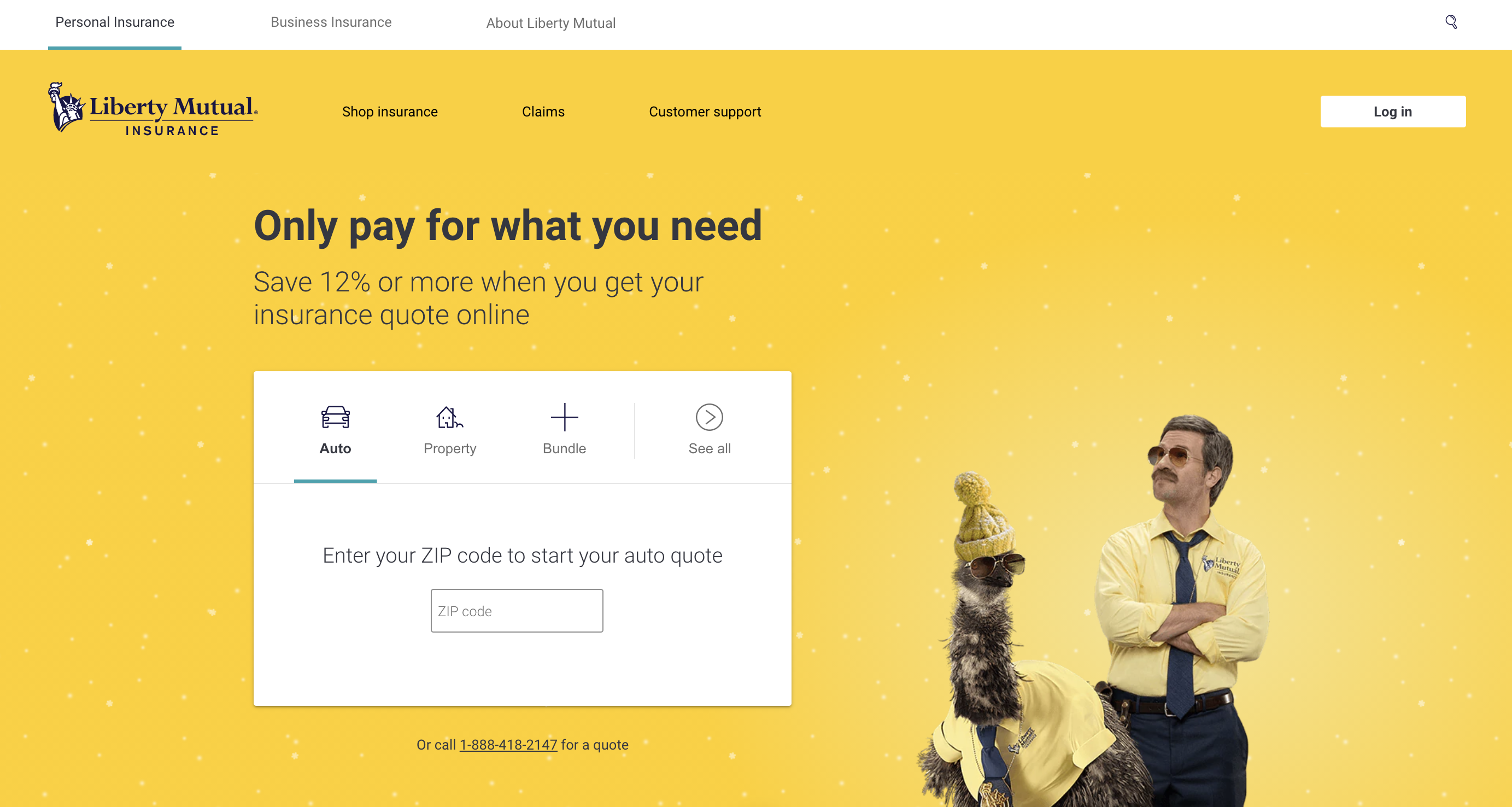
Our old website: