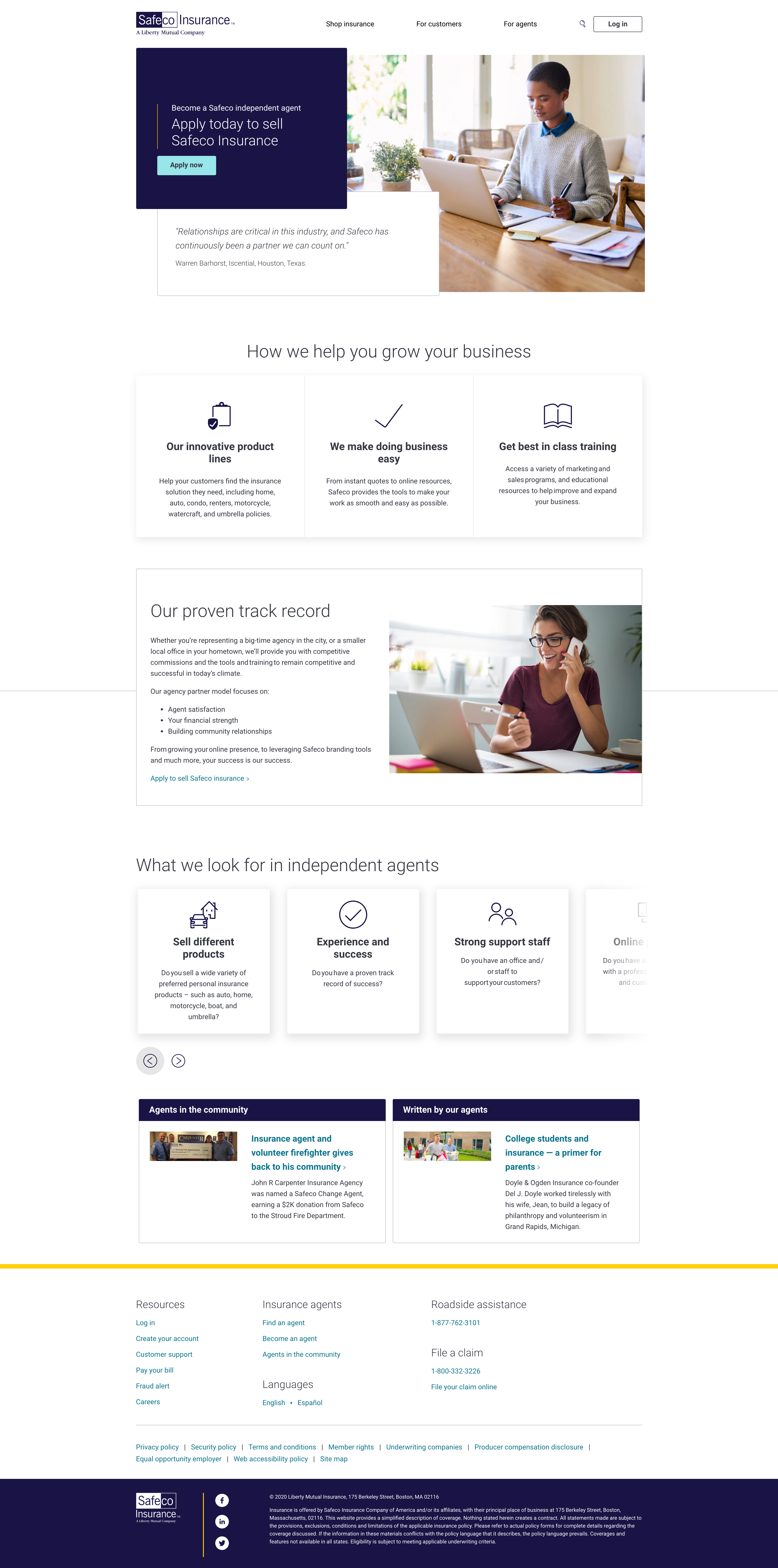
Bringing a new brand to life
Leveraging our design system

Building off of the work we completed on Liberty Mutual’s customer-facing website, my Product Design partner Dan Roge and I were tasked with redesigning and building a website for our sister company, Safeco.com — and quickly. We had less than a quarter to research, design, and get approvals of the new website.
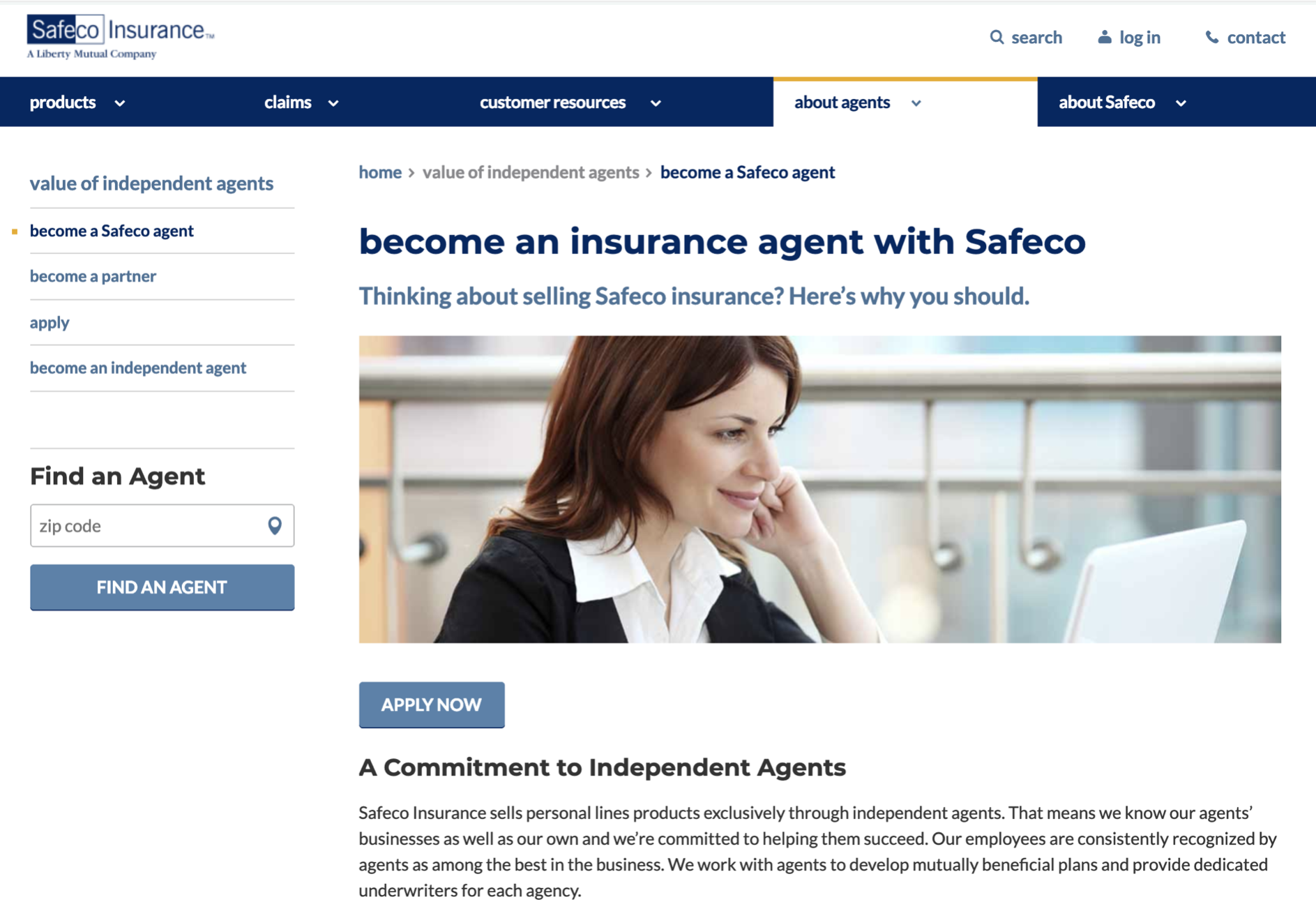
For context, the old website incorporated an obsolete brand, had a ton of duplicate and confusing pages, and — as we heard from the independent agents that sold Safeco Insurance — was not an experience they encouraged their customers to visit. (See below)

However, we now had one distinct advantage — a highly-evolved design system with fully-built components available for us to leverage. This allowed us to focus our efforts on the top half of the page — the hero — and create something unique to Safeco that would allow customers to perform their two most common actions quickly: Log in, or search for a local independent agent near them.
Aggressive content audit
As I noted earlier, the old Safeco website included several duplicative or overlapping pages without a clear audience; was the website for customers, agents, or both? The old website wasn’t sure, and the result was a bloated experience that needed to be paired down considerably. Not only that, data traffic painted a clear picture that nearly 90% of traffic was going to less than 12 pages. An aggressive audit was in order, and luckily Leadership was on board with an extended “kill” list.
![]()
Removing the unnecessary proved to be both easy and satisfying. Detail pages with less than 100 views? Axe’d. Multiple agent pages? Let’s consolidate to one and drive to our application form. In the end we were able to sunset more than a third of the website while creating a simple navigation clearly defined by user types: “For customers” and “For agents”. Easy enough.
Another total re-write
Finally, as Dan and I jammed on initial content outlines and sketches it became clear that we would once again need to tear down the content strategy as we knew it and start from scratch (we realized the same — quickly — while redesigning Liberty Mutual). Once again, we lucked out with stakeholders that were on the same page and put their trust in us.
Using learnings from a dozen interviews and lean research completed through Validately, I began the arduous process of piecing together marketing materials, brand guidelines, and our voice and tone best practices to create an all new voice for Safeco. One of the biggest opportunities was to highlight the independent agent service — considered the major business differentiator of the brand — while also driving customers to create warm leads by quoting online. This inspired some of my sneaky favorite copy I’ve ever written for UX:

The end result
In the end, Dan’s design and my content strategy perfectly complimented one another. We were also able to make great strides on our new CMS, which allowed us to build these pages quickly using YAML (Yet Another Markup Language – check out the visual below to see how a true headless CMS works). As with the new Liberty website, we were once again able to complete our launch ahead of schedule in December, 2020.
Our new website:


Old website:

